
Hi everyone! Today I have 6 brand new polishes to share with you from Pretty & Polished's Dusty Creme Collection. There are a total of 10 gorgeous cremes in this collection that are based on Pantone's fall trend colors of 2015. These cremes have fine grey flakes in them that give them a dusty/smoky appearance, so they are very unique. The Dusty Creme Collection launches on Wednesday, September 9th in Pretty & Polished's shop.

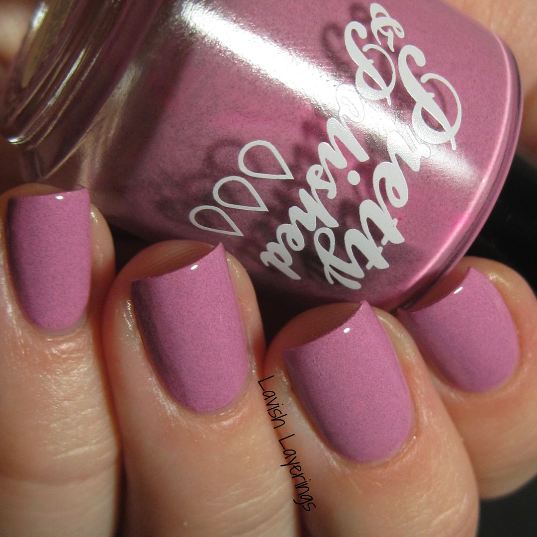
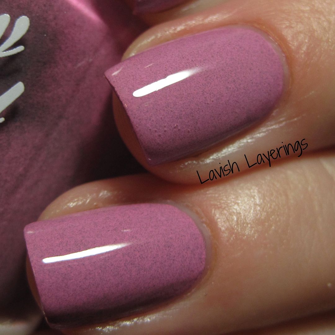
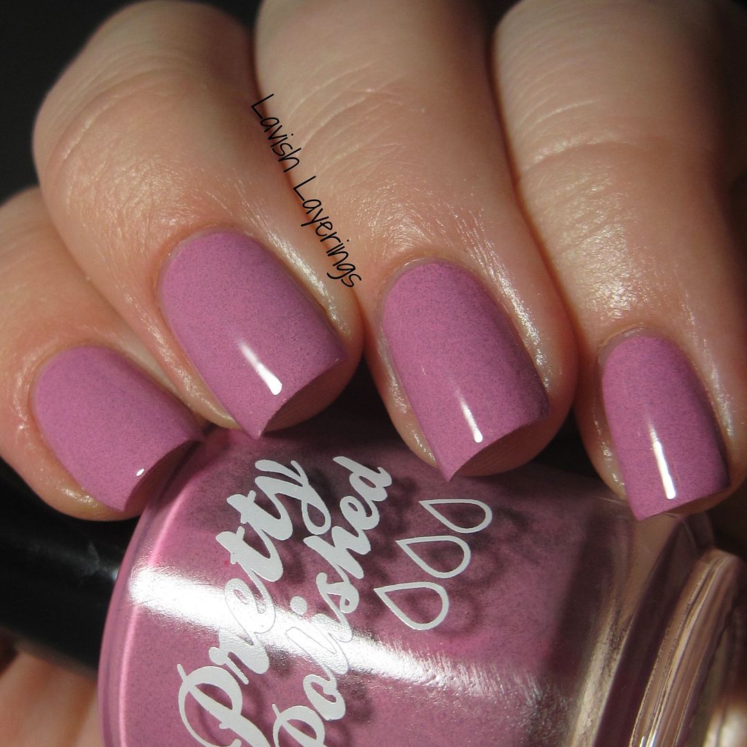
A Cashmere Rose By Any Other Name... is a rose pink creme with fine grey flakes. This is based on the Pantone color Cashmere Rose. This is such a lovely bright pink and the flakes give it such a great dusty look. It's definitely one of my favorites! (also please excuse my bubbly topcoat!)
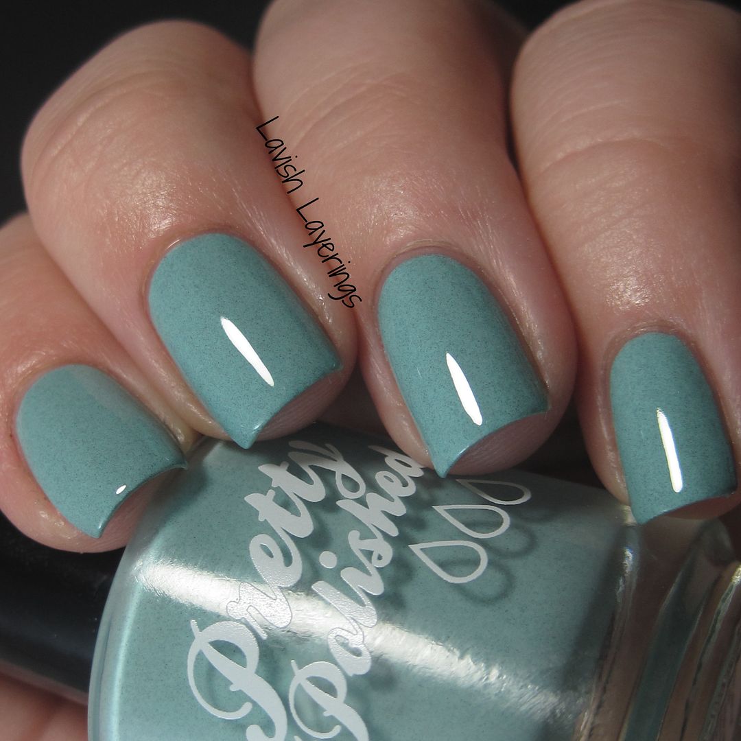
My Sage Advice is a pale green creme with blue undertones filled with fine grey flakes. This is based on the Pantone color Desert Sage. This is another color that is right up my alley and I've already worn it again since I swatched it. It's such a cool, soothing tone!


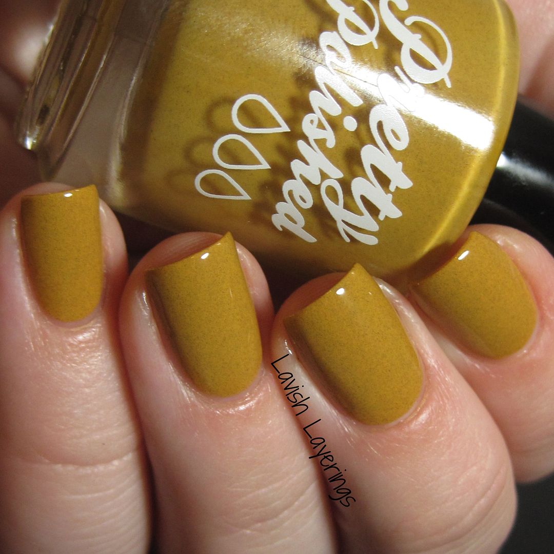
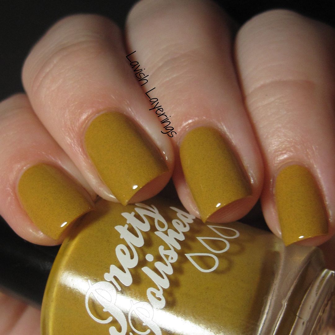
In the Buff is a mustard yellow creme filled with fine grey flakes. This is based on the Pantone color Oak Bluff. I was worried about how this polish would look on me, but I think that the flakes mellow it out a bit and make it more wearable. It's a fun, edgy color for fall. It reminds me a bit of hot mustard.

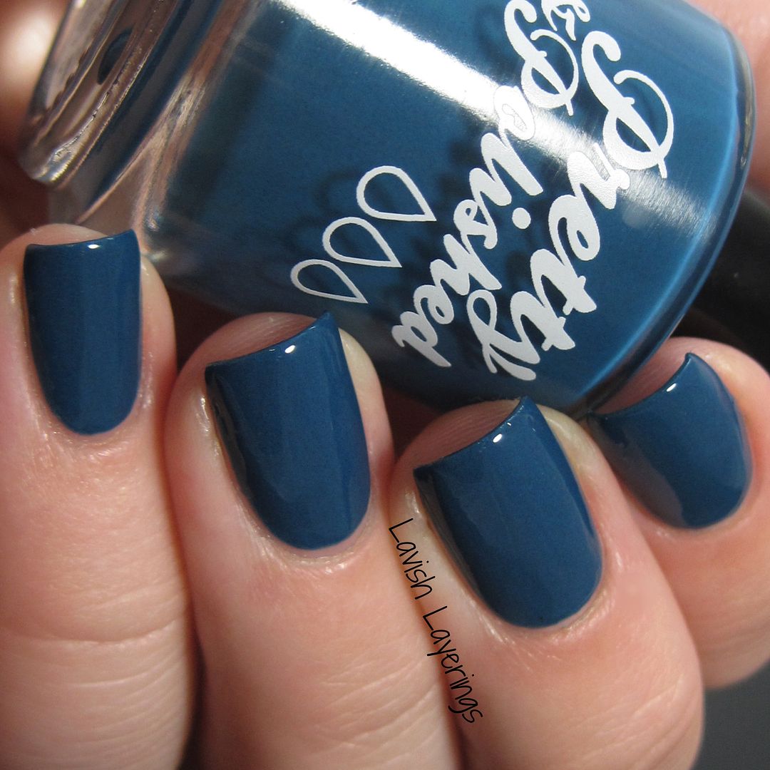
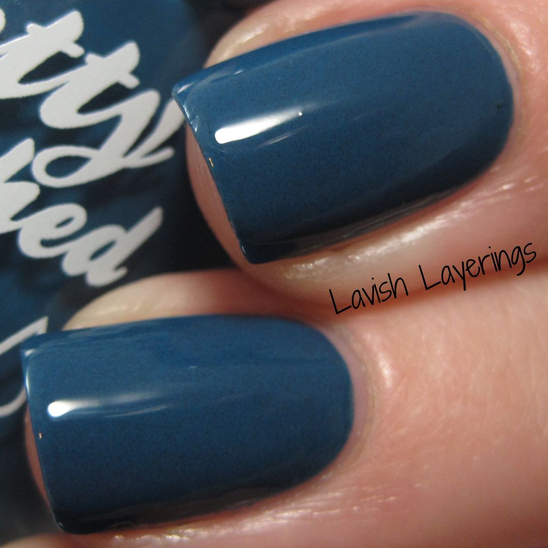
Reflect and Ponder is a deep blue base with a touch of brightness filled with fine grey flakes. This is based on the Pantone color Reflecting Pond. I love that this isn't a typical navy blue, but has the touch of vibrancy to it. The flakes aren't as obvious in this one as the others because of the darkness of the base color.
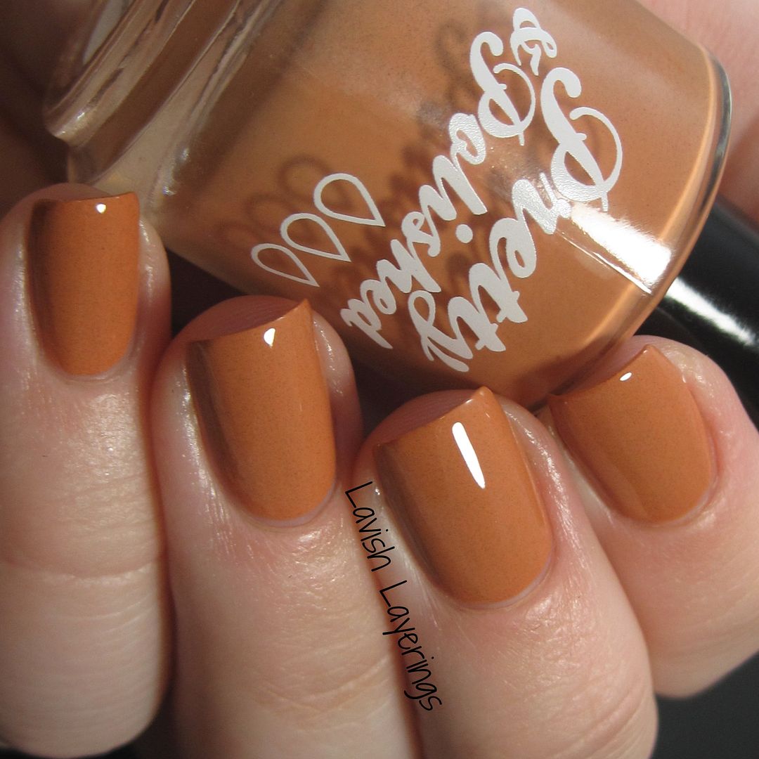
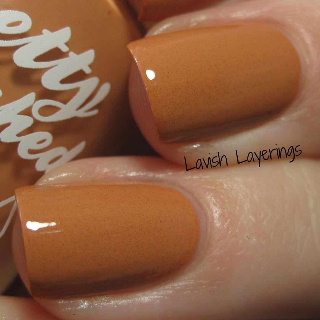
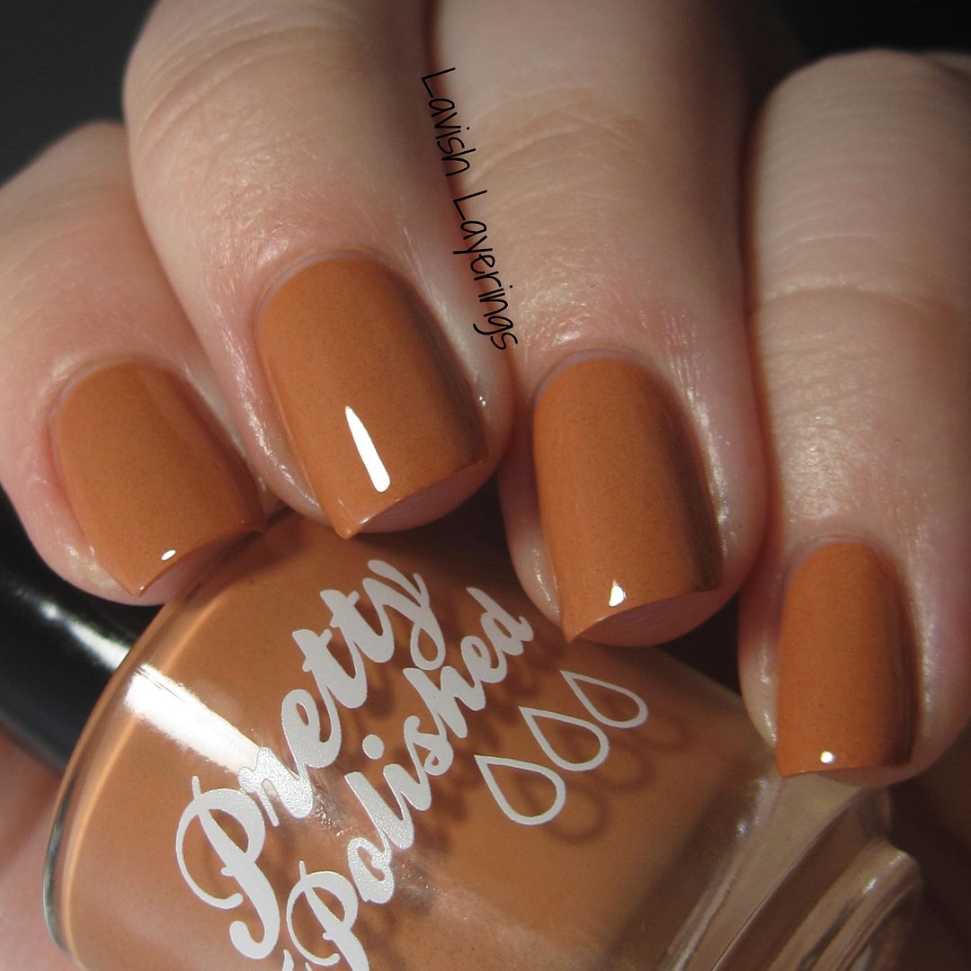
CD 255, 155 is a pumpkiny orange creme filled with fine grey flakes. This is based on the Pantone color, Cadmium Orange. I'm still trying to decide how I feel about this one. The color is really nice and I want to love it, but it somehow ends up looking like terra cotta on my skintone. I wore it for a full day and sometimes I liked it and sometimes I didn't. Overall, I just don't think it's the best for my skintone, but it's a nice and unique orange.
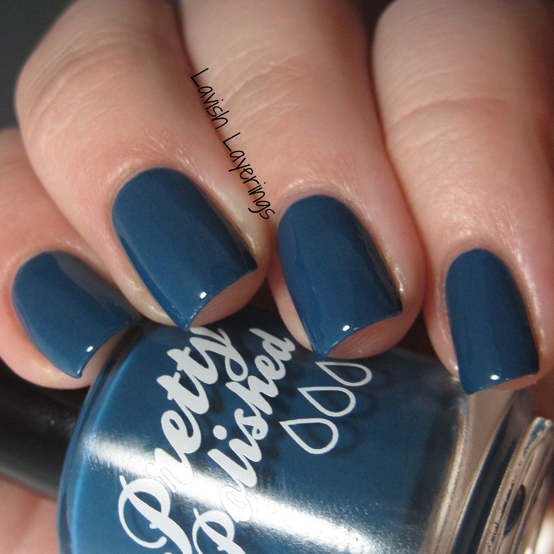
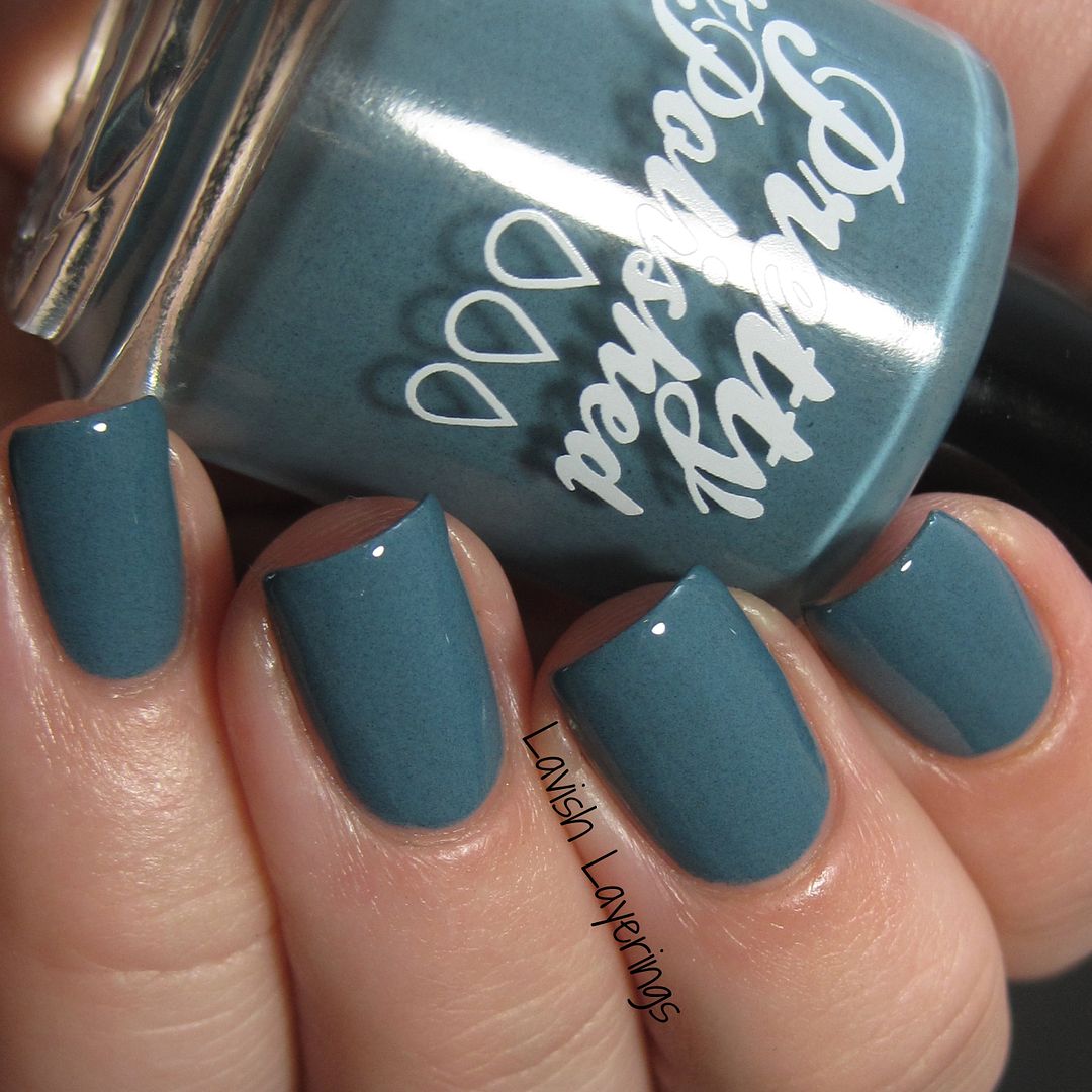
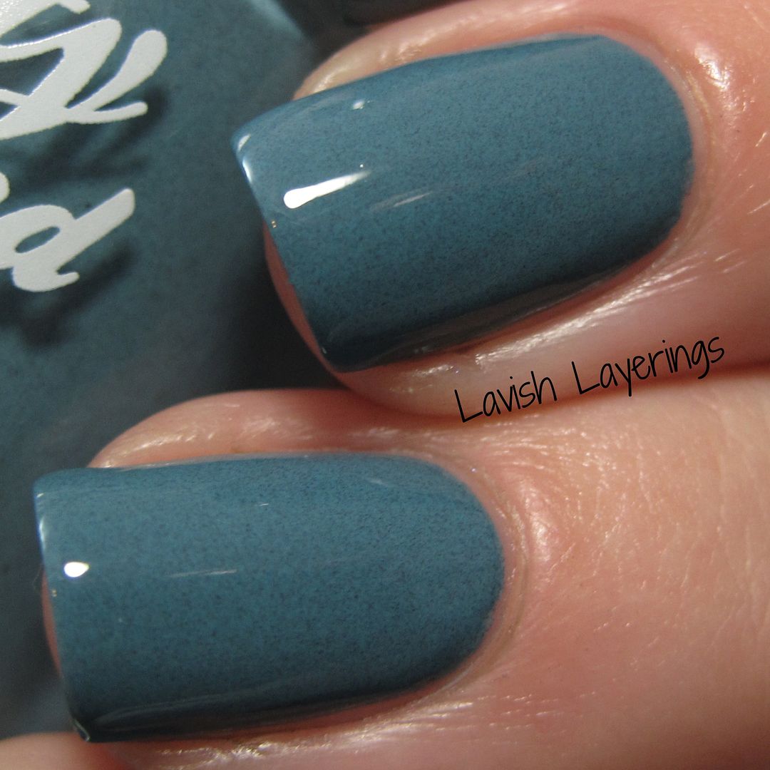
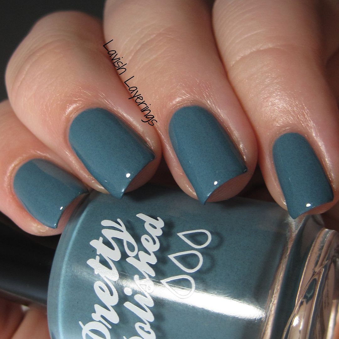
Weather the Storm is a medium greyish blue creme filled with fine grey flakes. This is based on the Pantone color Stormy Weather. This shade is perfection for fall and totally embodies its stormy inspiration.
Pretty & Polished products are available from their website or from these international locations. You can also follow them on Facebook , Instagram, and Twitter to see updates on new releases! Thanks for looking everyone!
Our factory is located in Guangzhou right now , where is the high quality shoe base, only half an hour to Baiyun Airport. We continue using the traditional leather shoesmanufacture technology, the main production process operated manually, can
ReplyDelete